Branding, Poster Design, TV Ad, Store-front Design
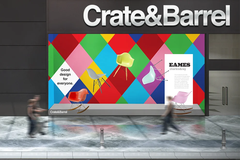
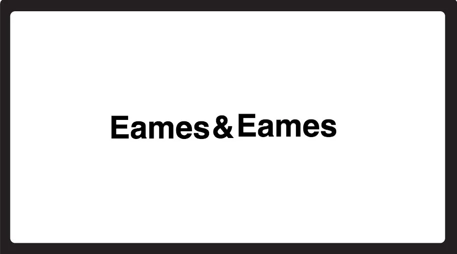
How can I communicate the message that contemporary furniture giant Crate&Barrel is now carrying Eames furniture? This is the question I tried to answer with this identity concept.
Crate&Barrel identity design is very clean, simple, black-and-white-straight-up type. My concept introduces colors and playfulness that was typical of the Eames designs.
The newly formed visual mark was then applied to different media showcasing a store-front design, a TV Ad introducing the partnership, and a promotional poster targeting children.
For the store front concept, I pushed the “Eames playfulness” and multimedia signatures forward. The display contains selected diamonds that lights up and features the floating chairs in the front.
For the TV Ad, I created a narrative based on combinations of words that communicate the essence of the new brand. Words were put together by the use of the ampersand symbol, a reference to the partnership of two but also a strong visual relation to the Crate & Barrel mark.
For the promotional poster targeting children, I borrowed many of the Eames visual designs found in textiles, furniture, and sculpture to create a whimsical poster targeting children. The poster is made of tear-off cards that once detached, become a set of the famous "House of Cards" game created by the Eames couple.